Choosing wedding colors is one of my favorite planning conversations because a palette sets the emotional temperature of the entire day. After hundreds of weddings, I have learned that the most successful designs are not the ones with the most colors, but the ones with the clearest feeling.
My planner notes for choosing a palette
- Start with the venue light and season before choosing shades.
- Use one main color, one supporting tone, and one accent.
- Always test fabrics, flowers, and stationery together before ordering.
These seven elegant wedding color schemes are the combinations I return to when couples want a celebration that feels polished, welcoming, and beautifully lived-in.
Ivory and Champagne: Timeless Luxury for Elegant Weddings
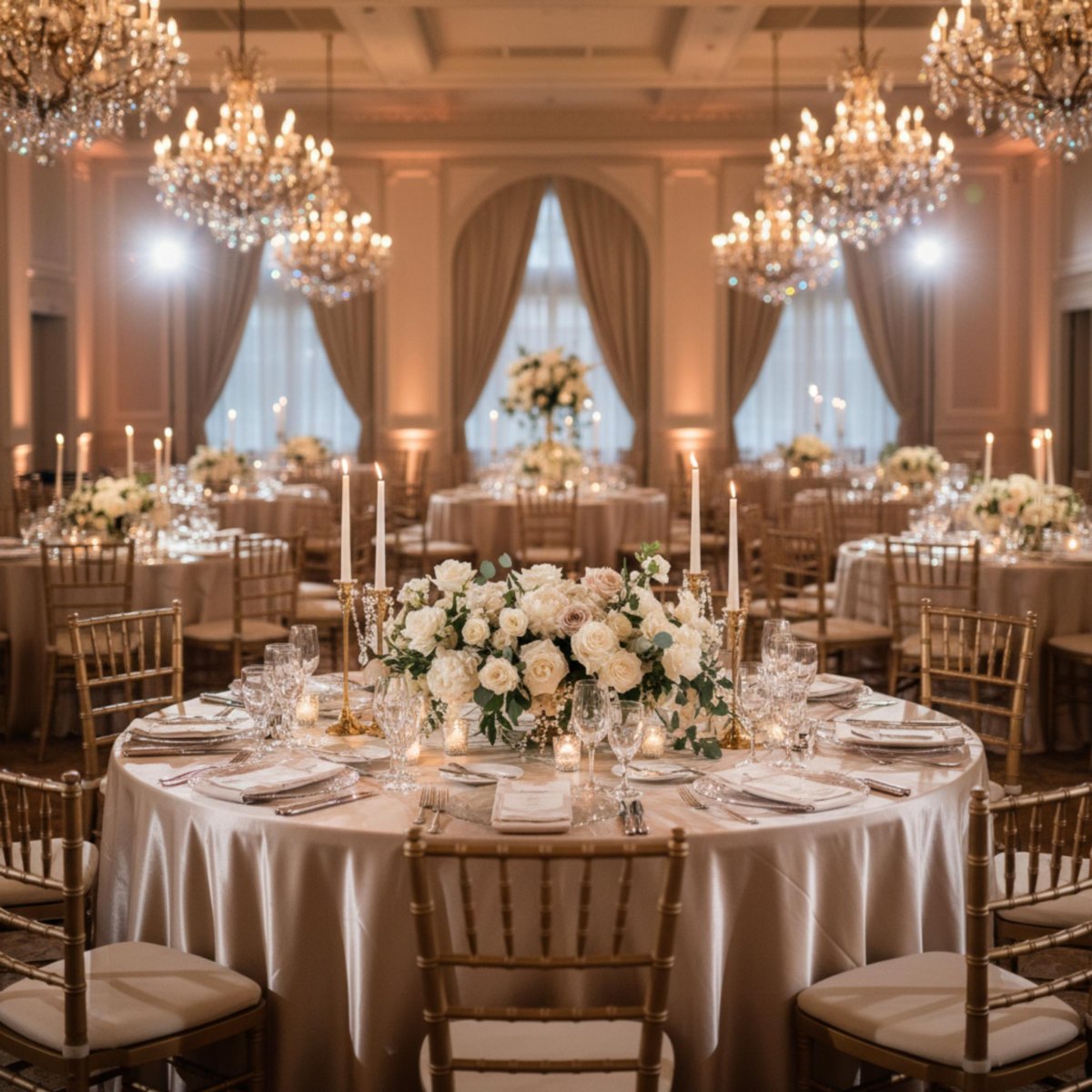
Ivory and champagne remain a favorite for couples who want a wedding that feels graceful without feeling overly decorated. I love this palette because it lets textures do the talking: silk ribbons, candlelight, soft linens, and layered florals create the richness.
The key is keeping the shades varied. Warm neutral layering prevents an ivory room from looking flat and gives the celebration that quiet luxury feeling I see often in classic venues.
Planner tip
Mix ivory flowers with champagne metallic details rather than matching every element exactly. Small differences make the room feel collected.
Black and Gold: Glamorous Sophistication for Evening Celebrations
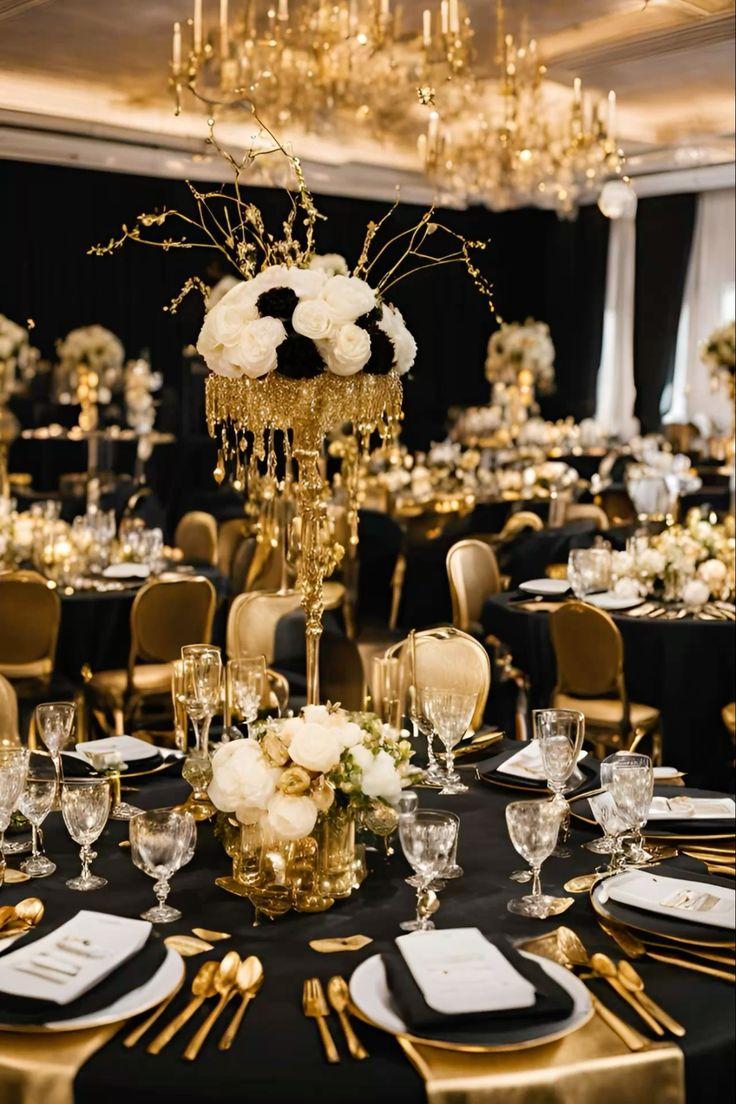
Black and gold is the palette I reach for when a couple wants drama after sunset. It works beautifully in ballrooms and historic spaces where candlelight can soften the deeper tones.
I usually recommend using black as a foundation rather than the dominant feature. Balanced metallic accents such as gold flatware, frames, or stationery details create elegance without making the room feel like a themed event.
| Element | My styling choice |
|---|---|
| Linens | Black napkins or runners |
| Metal details | Soft gold finishes |
Blush Pink and Rose Gold: Romantic Modern Elegance
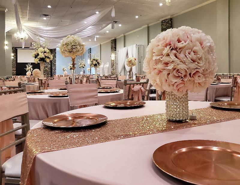
Blush pink and rose gold have stayed popular because they strike a lovely balance between romantic and contemporary. Wedding color trend coverage continues to highlight pink families as versatile choices for modern celebrations.
When I plan with this palette, I avoid making everything pastel. Adding deeper blush variations, creamy whites, or natural greenery keeps the design mature and photographs beautifully.
Sage Green and White: Natural Minimalist Wedding Style
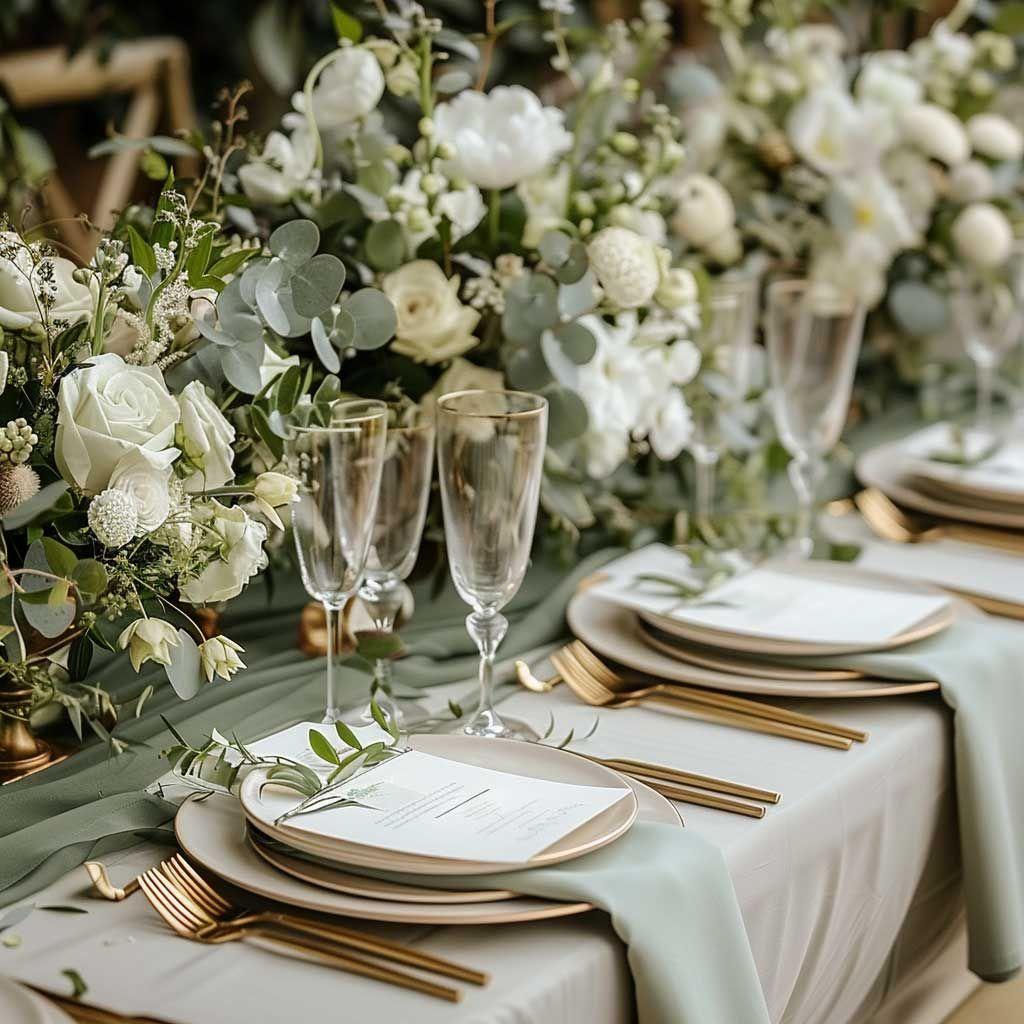
Sage green and white is one of the most dependable combinations for garden, vineyard, and minimalist weddings. Its soft gray-green quality pairs naturally with foliage, ivory blooms, and understated details.
I especially love this palette for couples who want elegance without excess. Organic simplicity gives the venue room to shine while keeping the tables and ceremony spaces cohesive.
Where this palette shines
Outdoor ceremonies, airy reception spaces, and celebrations with botanical details are where sage green feels most effortless.
Navy Blue and Silver: Classic Refined Wedding Palette
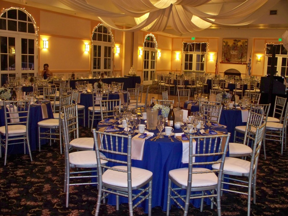
Navy blue and silver is a wonderful choice for couples who want formality with a cooler, cleaner feel. I often see this pairing work especially well for evening weddings, coastal settings, and elegant winter celebrations.
The secret is adding softness. Silver with warm candlelight keeps navy from feeling too corporate and turns it into a romantic wedding color story.
Why I love it
- Feels polished and timeless.
- Works well with formal attire.
Watch for
- Too much dark color in poorly lit rooms.
- Overusing metallic details.
Burgundy and Gold: Rich Autumn-Inspired Wedding Colors
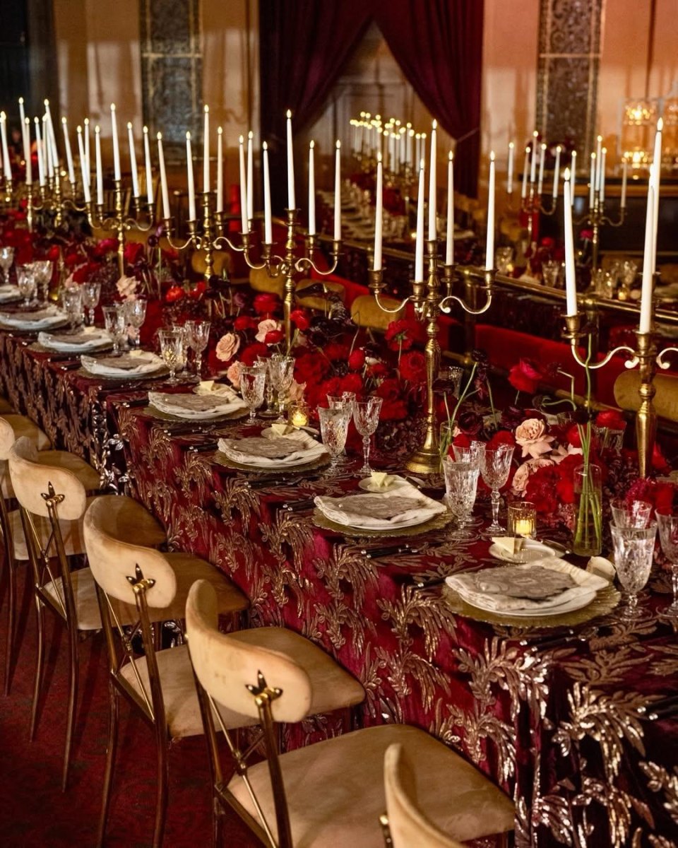
Burgundy and gold brings warmth, depth, and a little old-world romance to an autumn wedding. Floral and wedding design sources frequently feature this pairing for fall celebrations because the colors create a luxurious seasonal atmosphere.
I love using burgundy carefully: a velvet ribbon, a floral accent, or a few statement blooms can do more than covering every surface. Intentional jewel tones create richness while keeping the room comfortable.
Soft Lavender and Pearl: Graceful Fairytale Wedding Tones
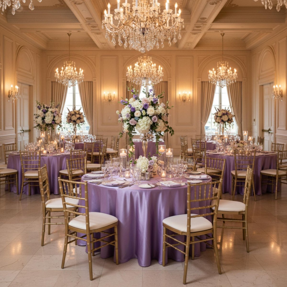
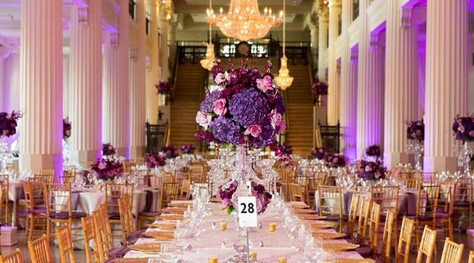
Soft lavender and pearl creates the kind of wedding atmosphere that feels airy, romantic, and slightly storybook. I like it for couples who want something delicate without relying only on traditional blush tones.
The most beautiful versions include layers of texture: pearls, soft fabrics, pale florals, and reflective details. Dreamy lavender balance comes from pairing the color with quiet neutrals rather than overwhelming it.
- Choose. Pick lavender as the emotional anchor.
- Layer. Add pearl, cream, and subtle metallic finishes.
- Test. View the palette in your venue lighting.