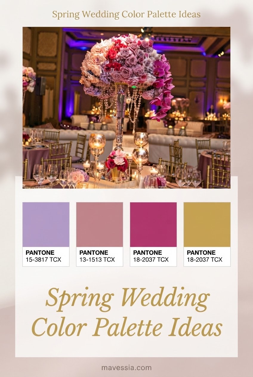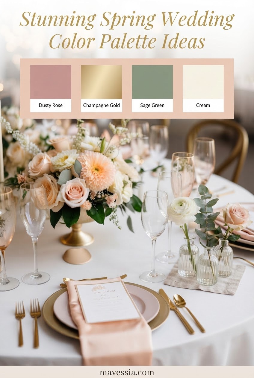
Choosing wedding colors feels wonderfully exciting until you are standing in a rental showroom surrounded by fifty shades of linen. I have watched couples make this decision at every stage of planning, and the trick is not finding the prettiest color — it is finding the palette that makes your venue, flowers, photographs, and budget work together.
Spring weddings naturally welcome softer tones, garden-inspired greens, and layered combinations rather than one flat color. Current wedding color discussions continue to highlight shades like blush, sage, lavender, dusty blue, and nature-inspired palettes as popular choices for spring celebrations.
Spring wedding palette planning at a glance
- Start with one favorite shade and build around it.
- Use neutrals to keep flowers, linens, and attire balanced.
- Choose colors that look beautiful in your venue’s natural light.
Blush Pink and Soft Sage Spring Wedding Palette
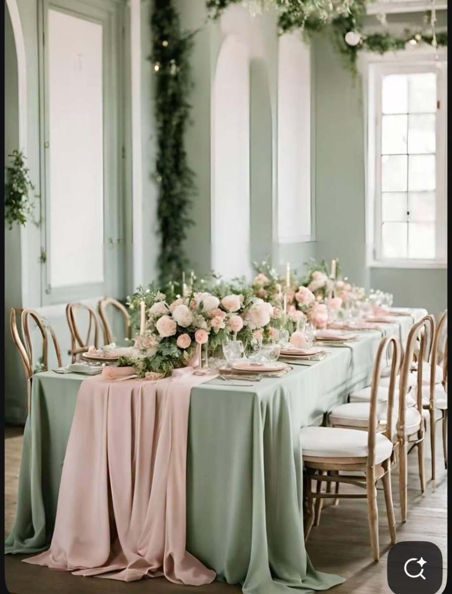
I have used blush pink and sage together for garden weddings because they feel romantic without becoming overly sweet. The green grounds the softness of blush, creating a palette that photographs beautifully among spring foliage and flowers.
For a balanced look, I like blush in bouquets, ribbons, and bridesmaid details while sage works beautifully for linens, stationery, or greenery. This pairing remains a frequently mentioned spring wedding combination because it blends natural tones with gentle warmth.
Planner tip
Let your neutral shade do some work. Ivory napkins or cream stationery can keep pastel colors from feeling too sugary.
Lavender and Ivory Garden Wedding Palette
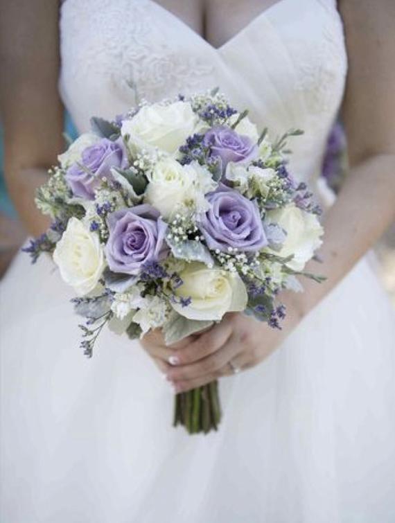
Lavender and ivory always reminds me of a spring garden just after a light rain. I love this lavender wedding palette for couples who want something floral and elegant without choosing traditional pink.
I would pair lavender blooms with ivory linens, soft greenery, and delicate gold touches. The result feels timeless, especially for outdoor ceremonies surrounded by flowering trees or garden paths.
- Best setting: Garden venues, historic homes, and romantic outdoor spaces.
- Easy accent: Add silver or gold details through candles and stationery.
Peach and Champagne Elegant Spring Wedding Palette
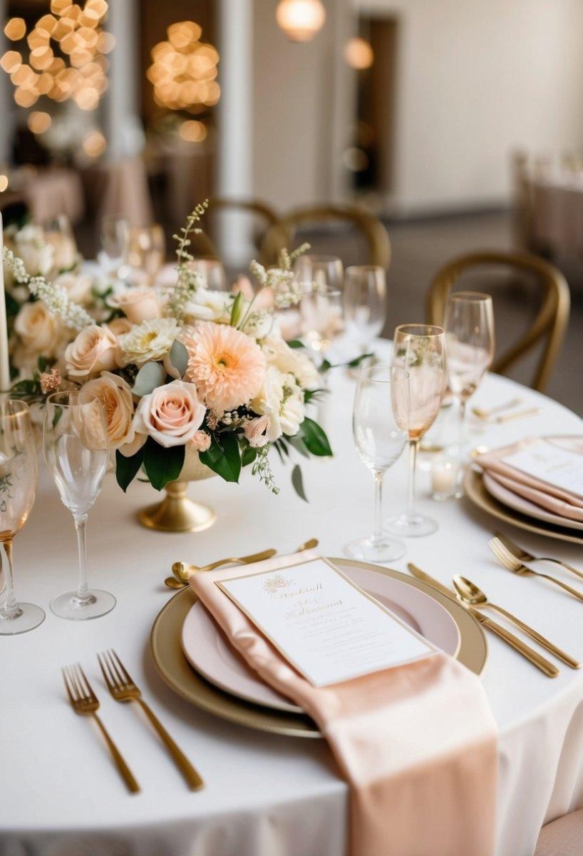
Peach and champagne is one of those palettes that looks expensive without requiring every detail to be elaborate. I have seen this peach champagne combination shine with simple flowers, warm candlelight, and textured fabrics.
The secret is using champagne as the quiet background and allowing peach to appear in flowers, menus, and small decorative moments. It creates a welcoming spring atmosphere that feels polished but comfortable.
Why it works
- Soft and flattering in photographs
- Pairs well with seasonal flowers
Watch for
- Too many warm tones can lose contrast
- Needs a neutral anchor
Dusty Blue and White Coastal Spring Wedding Palette
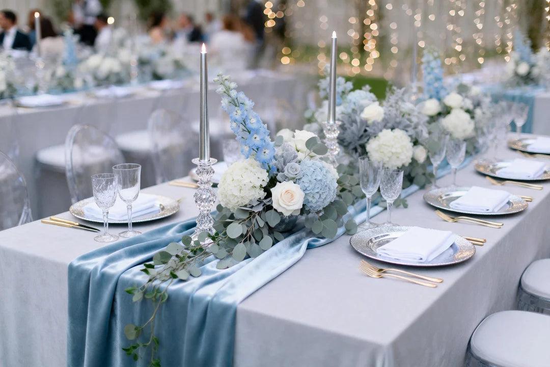
Dusty blue has always had a calm quality that works beautifully for coastal celebrations. I love this dusty blue and white palette because it feels airy, elegant, and relaxed rather than themed.
For a seaside wedding, I would bring in white flowers, glass accents, and natural textures. Dusty blue is also flexible because it pairs well with ivory, greenery, and metallic details.
| Element | Color idea |
|---|---|
| Linens | Dusty blue runners |
| Flowers | White blooms and greenery |
Coral and Mint Fresh Spring Wedding Palette
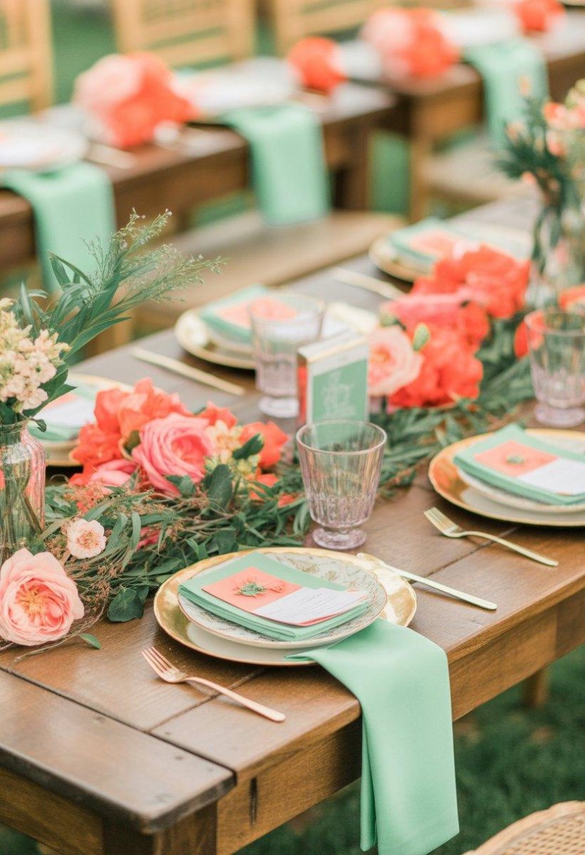
Coral and mint brings the cheerful side of spring forward. I reach for this coral mint pairing when couples want color that feels lively but still wedding-appropriate.
Keep mint in the background with greenery, glassware, or subtle stationery, then let coral flowers create the moments guests notice first. It is especially lovely for daytime receptions.
- Choose one dominant color.
- Add a creamy neutral for balance.
- Repeat colors across flowers and paper goods.
Yellow and Green Botanical Spring Wedding Palette
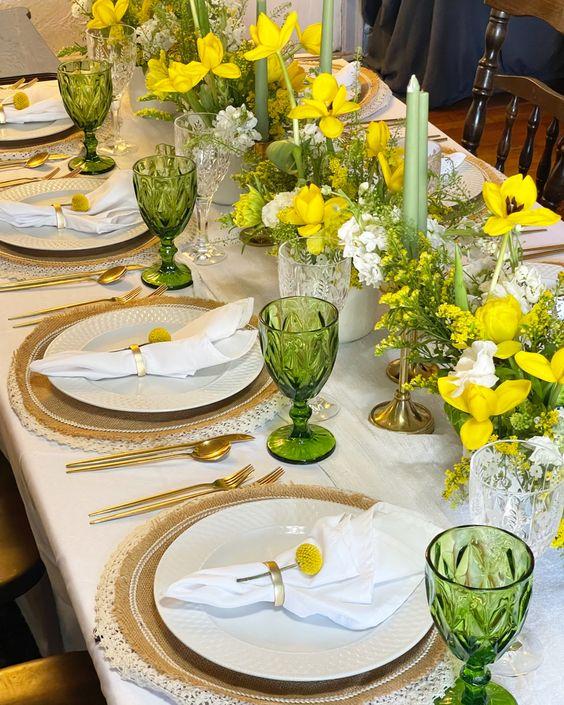
Yellow and green feels like bringing the garden directly onto the table. I love this botanical wedding palette for couples who want their flowers to feel like the main decoration.
Butter yellow blooms, fresh greenery, and natural textures can create a cheerful setting without looking like a summer picnic. It works especially well in outdoor venues where the landscape becomes part of the design.
3
core elements I use for botanical palettes: flowers, foliage, and natural textures
Mauve and Gold Romantic Spring Wedding Palette
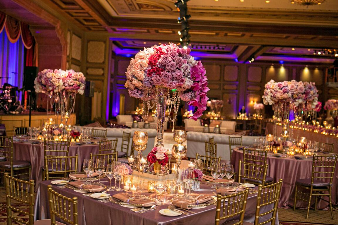
Mauve and gold gives spring romance a slightly more grown-up feeling. I like using mauve wedding details when couples want softness with a little drama.
Gold works best as a small highlight through candleholders, flatware, or invitation lettering. The mauve carries the emotion while the metallic touches add celebration.
Terracotta and Blush Bohemian Spring Wedding Palette
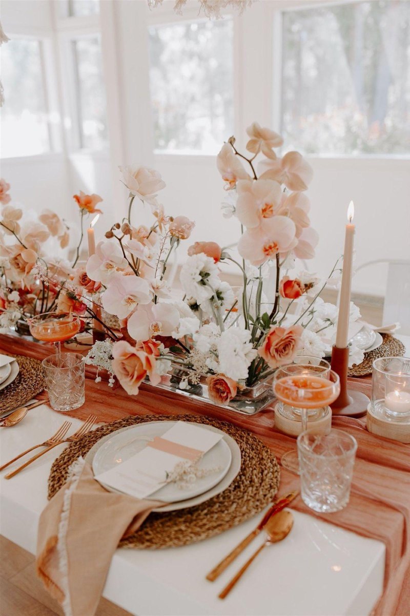
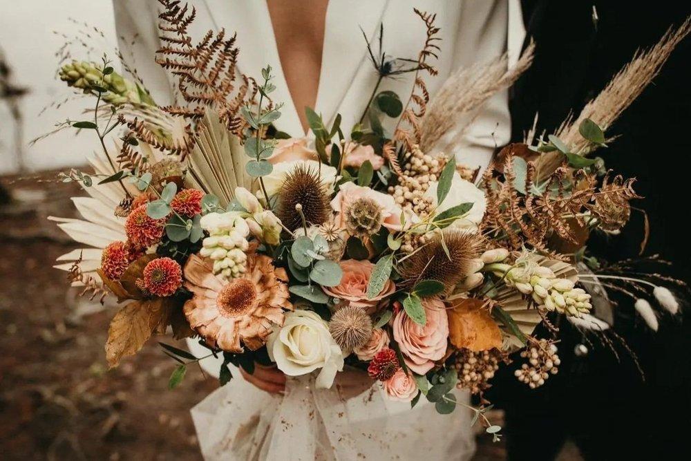
Terracotta and blush is for couples who want warmth, texture, and a little bohemian personality. I love this terracotta wedding palette because it feels handmade and welcoming.
Balance the earthy terracotta with blush flowers, cream fabrics, and greenery so the colors feel layered instead of heavy. This warm-and-soft combination continues to appear in modern wedding palette inspiration.
Common mistake
Do not let terracotta take over every surface. A few strong accents usually look more intentional.
Emerald and White Classic Spring Wedding Palette
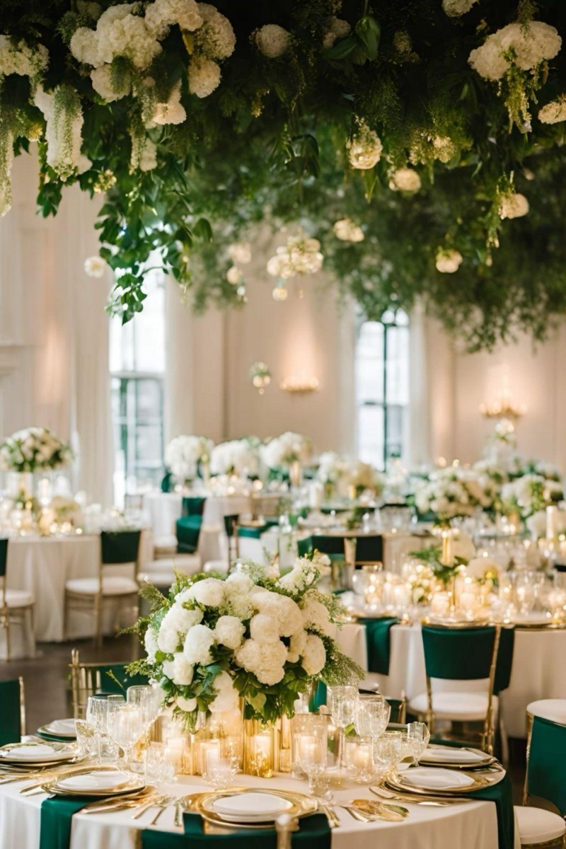
Emerald and white creates a classic look with strong contrast. I recommend this emerald green palette for couples who want their spring wedding to feel elegant and formal.
White flowers keep the design fresh while emerald details add richness through velvet accents, stationery, or attire. It is a palette that can move easily from garden weddings to ballroom receptions.
- Choose. Select emerald for statement pieces.
- Balance. Add white flowers and neutral fabrics.
- Repeat. Carry the colors through small details.
Lilac and Peach Whimsical Spring Wedding Palette
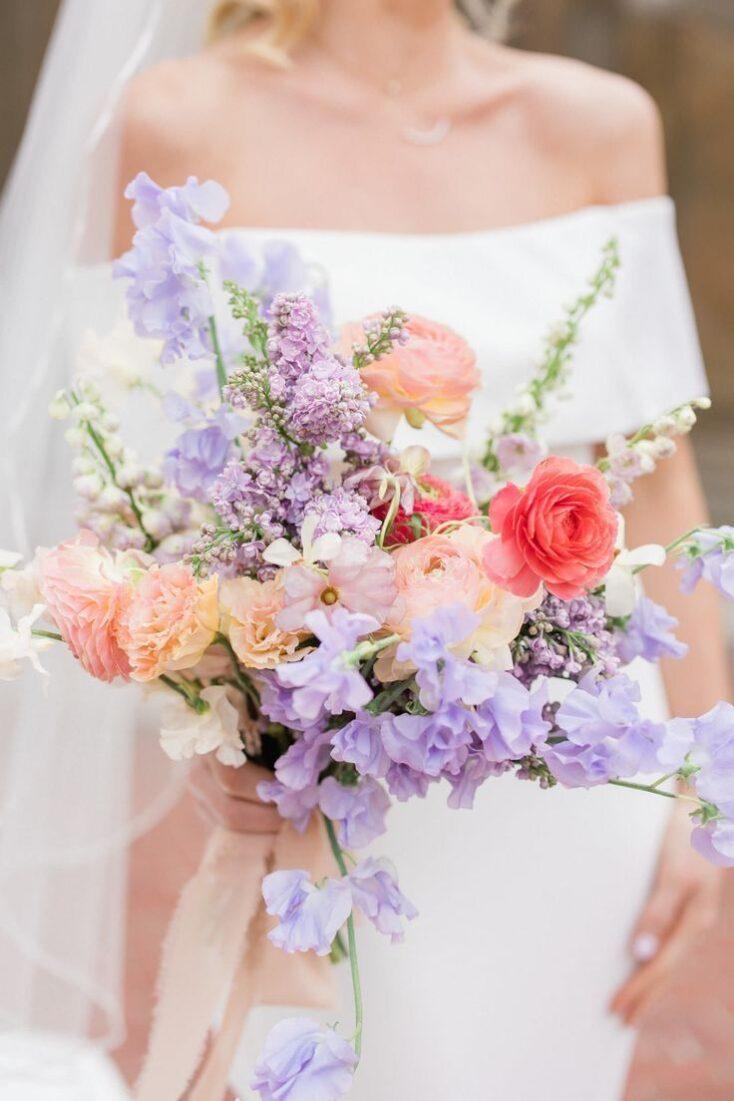
Lilac and peach feels playful, floral, and full of spring personality. I love this lilac peach combination for couples who want something romantic but less expected.
Use lilac in delicate flowers and paper details, then bring peach forward with warmer blooms and candlelight. The two shades create depth while keeping the overall mood soft.
My favorite use
I especially love this palette for smaller garden weddings where every floral detail gets a chance to shine.
Neutral Beige and Green Minimalist Spring Wedding Palette
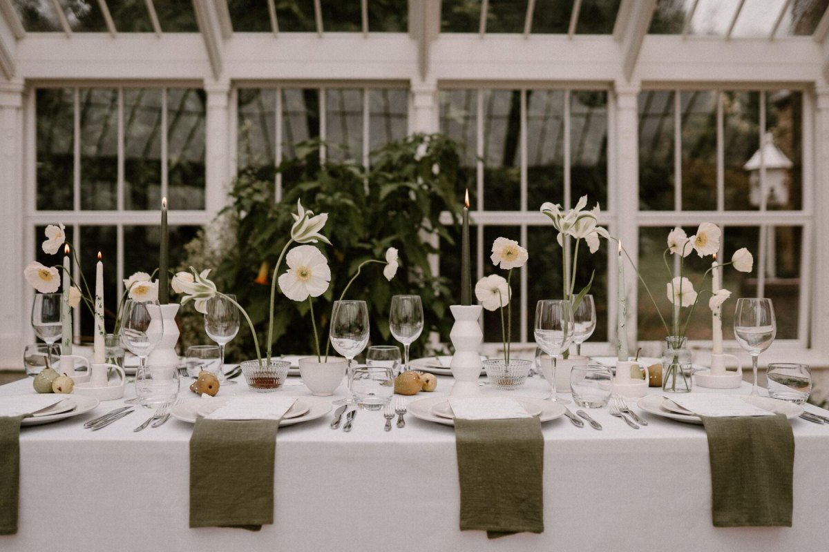
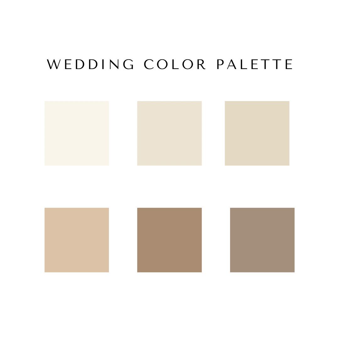
Neutral beige and green is proof that a spring wedding does not need bright colors to feel special. This minimalist wedding palette creates a calm backdrop where architecture, food, and meaningful details can stand out.
I often suggest this style for couples who want elegance without a lot of decoration. Linen textures, greenery, candles, and simple flowers can carry the entire design beautifully.
A practical planning note
Spend your budget where guests interact most: tables, lighting, and comfortable seating. Those details are remembered long after the color samples are packed away.
More Pinterest Visuals