I've stood in more open-concept great rooms than most designers, timing cocktail hours around sightlines from kitchen to dining to living room — and the palettes that actually work are never the ones with the most colors. They're the ones with the most discipline. Here are seven whole-home palette strategies I'd trust in a house that gets used, hosted in, and lived in on a Tuesday as much as a holiday.
The Cool Tonal Palette: One Family, Five Depths
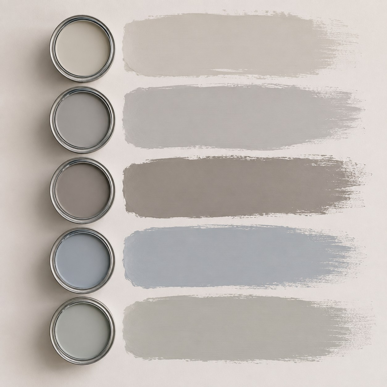
This is the palette I'd hand a nervous first-time painter, because every decision is already made for you: five shades, one undertone family, moving from a barely-there greige at the top of the range down to a dusky blue-gray at the bottom. Nothing fights.
- Ceiling and trim take the lightest tone
- Main walls sit in the middle, greige to taupe
- An accent wall or door gets the deepest blue-gray
The trick is testing all five on the same wall, in the same light, before you commit — the difference between a cool gray and a warm one only shows up once afternoon sun hits it. I learned that the hard way repainting my own dining room twice in one October.
A tonal palette isn't boring. It's just quiet enough that your furniture gets to talk.
Adapt it by swapping the blue for a soft green if your home runs warmer — the structure holds, only the accent note changes.
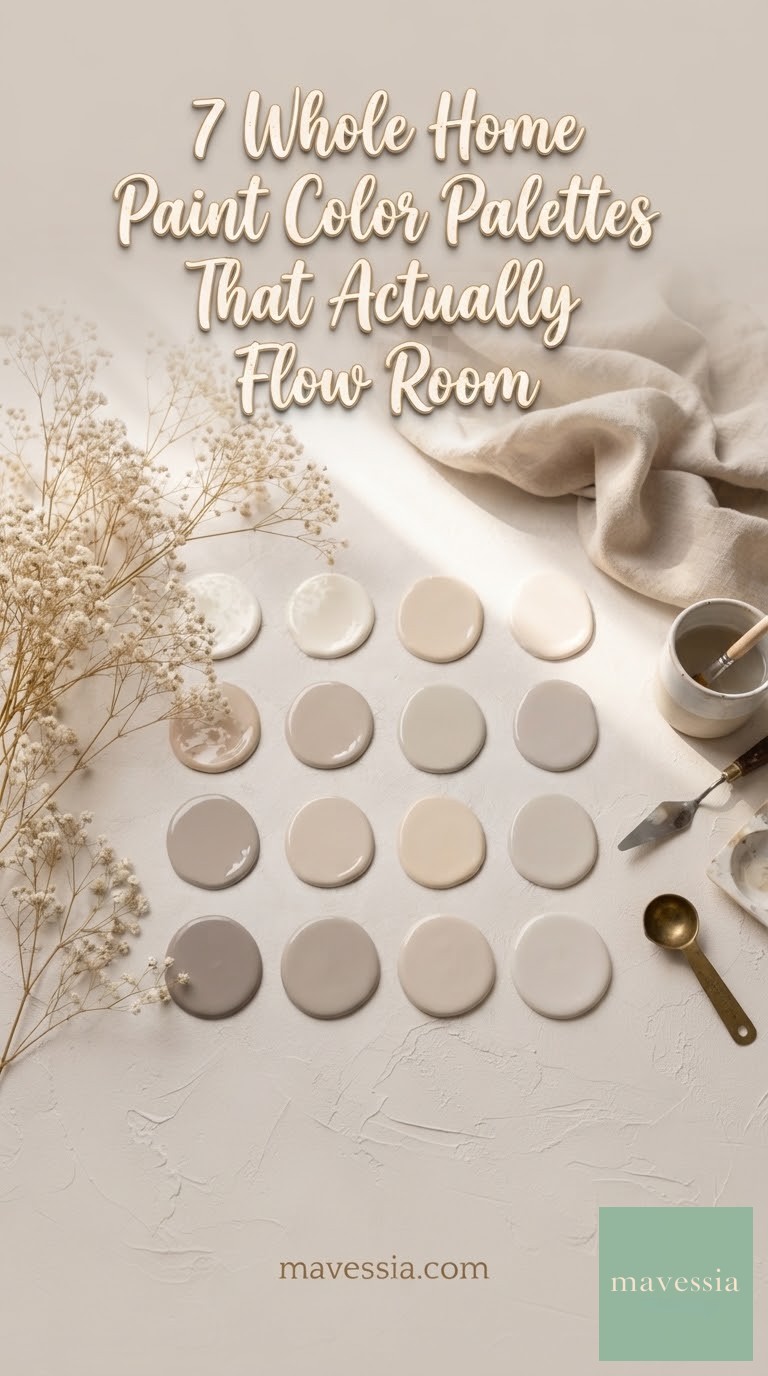
The Warm Neutral Capsule: Twelve Shades, One Undertone
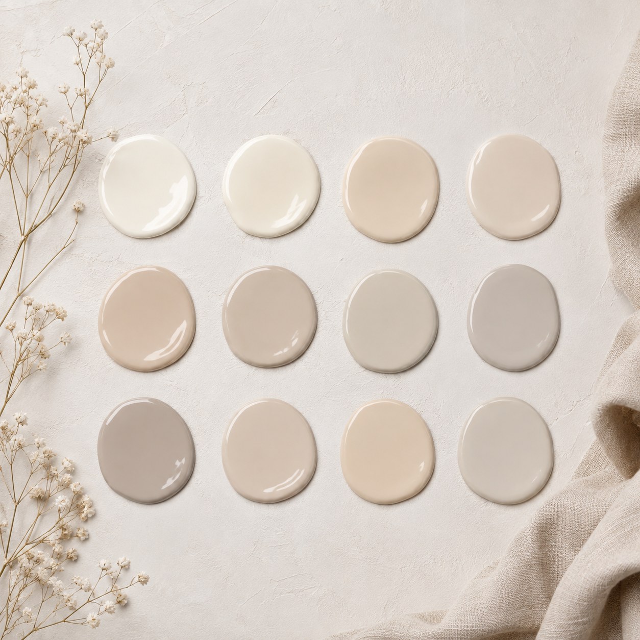
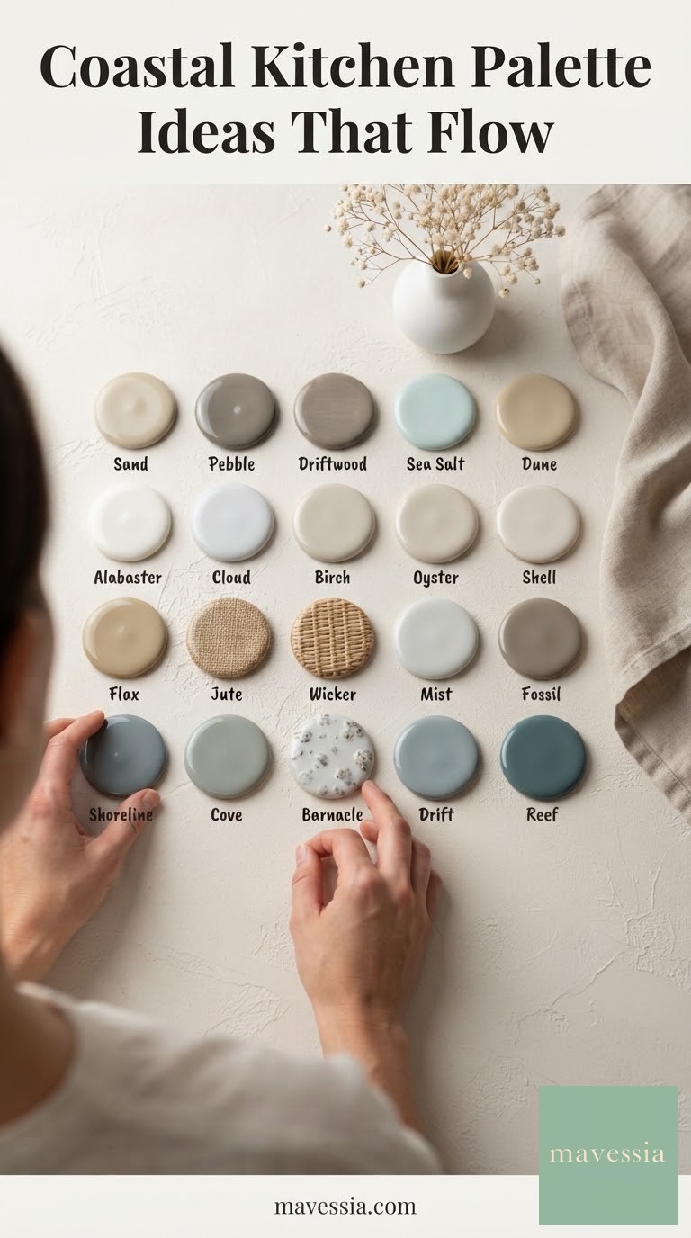
Twelve swatches sounds like too many choices until you realize they're all built on the same warm base — cream sliding into beige, beige into taupe, taupe into a soft warm gray. This is the palette for a house with a lot of natural wood, brass hardware, or a kitchen you're not ready to give up.
How to use it across a whole house:
- Entry and hallways in the lightest creams for flow and light-bounce
- Bedrooms in the mid-range beiges for warmth without heaviness
- A study or den in the deepest taupe for contrast that still belongs
The failure mode here is picking warm neutrals from different collections that each claim to be "greige" but read differently side by side — test them together, not in isolation, before a single can gets opened.
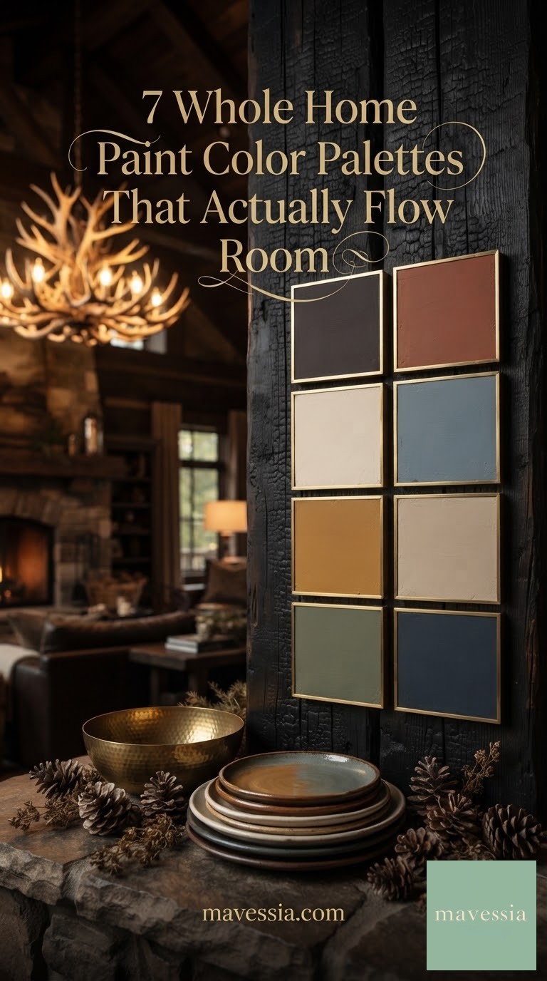
The Moody Cabin Palette: Dark, Rich, and Made for Evening
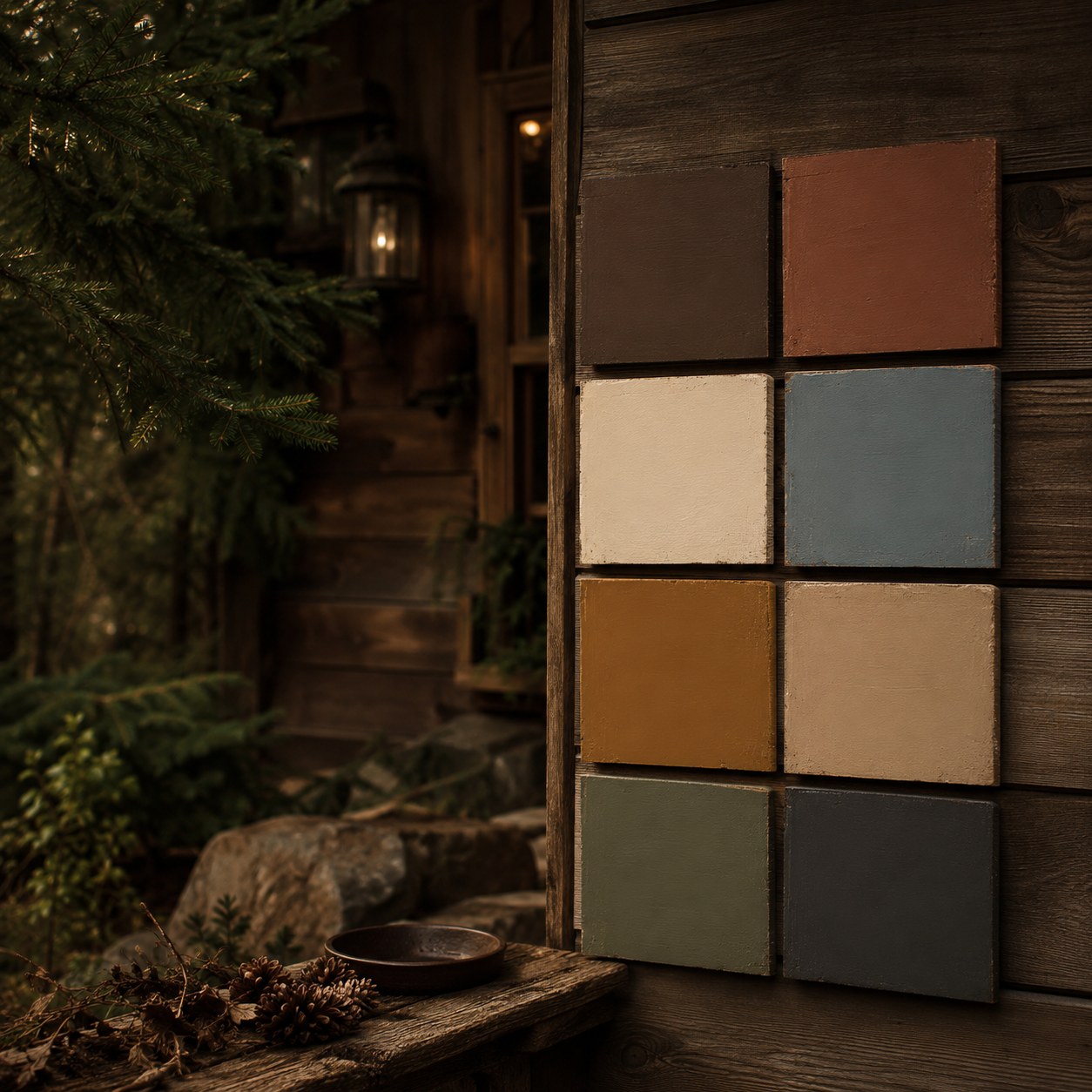
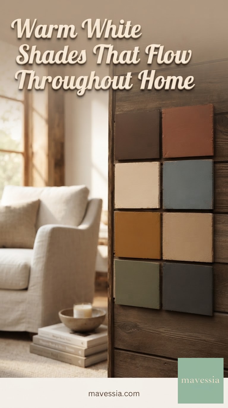
Charcoal, rust, mustard, forest, ink blue, a warm cream to keep it grounded — this palette is built for houses that get used most after dark, by lamplight and firelight rather than daylight. I keep coming back to it for a den or a mudroom because dark colors don't show wear the way pale ones do, and that matters in a house with kids, a dog, and a lot of coats coming through the door.
The rule I'd give any reader borrowing this palette for a whole home: pick one dark neutral (the charcoal or the ink blue) to repeat as your anchor in three or four rooms, then let the rust and mustard show up once each, as a door or a single accent wall. Repeating that anchor is what keeps a dark palette from feeling like eight separate decisions instead of one house.
- Best for: dens, mudrooms, powder rooms, exterior doors
- Skip it if: your rooms get very little natural light already
The Earthy Eight-Can Wreath: A Palette Built to Rotate
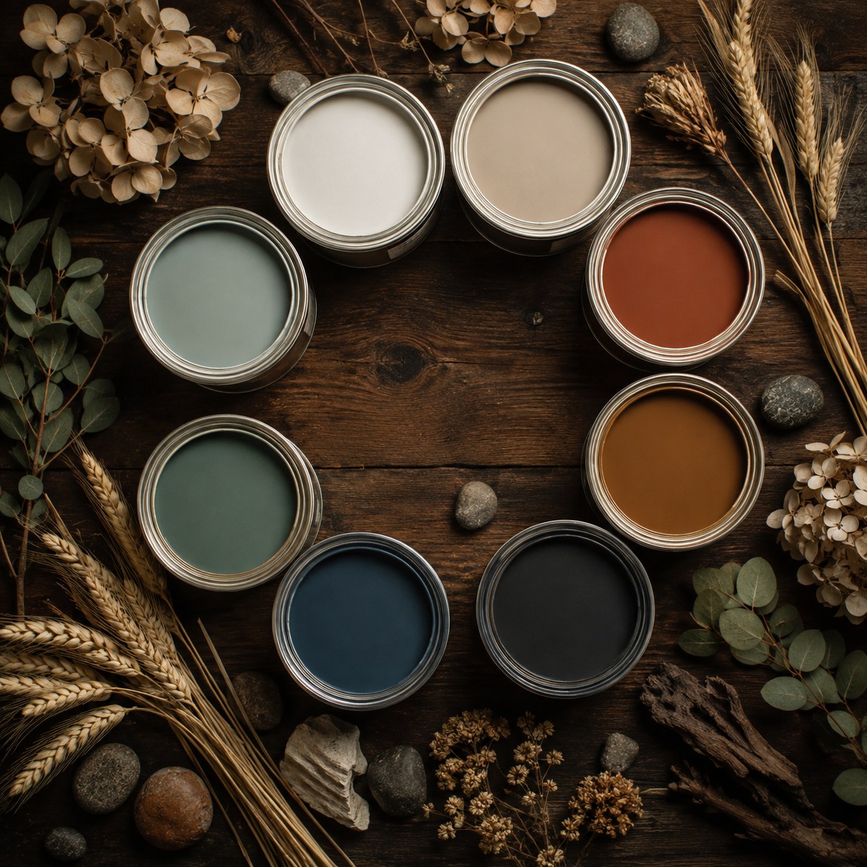
Eight cans arranged like a wreath is basically a seating chart for color — each one earns its place, and none of them sit at the head of the table alone. Sage, navy, charcoal, rust, mustard, cream, taupe, and a blue-gray, all pulled from the same earthy, low-saturation family.
Where each one goes in a whole home
- Cream and taupe — main living spaces, ceilings, trim
- Sage and blue-gray — bedrooms and bathrooms
- Navy or charcoal — front door, kitchen island, built-ins
- Rust and mustard — small doses only: a powder room, a mudroom bench
This is a full-house palette that ages well because the saturated colors are rationed. I'd rather see mustard on one closet door than one whole wall — it reads as intentional instead of overwhelming, and you're never stuck repainting a huge surface if the trend moves on.
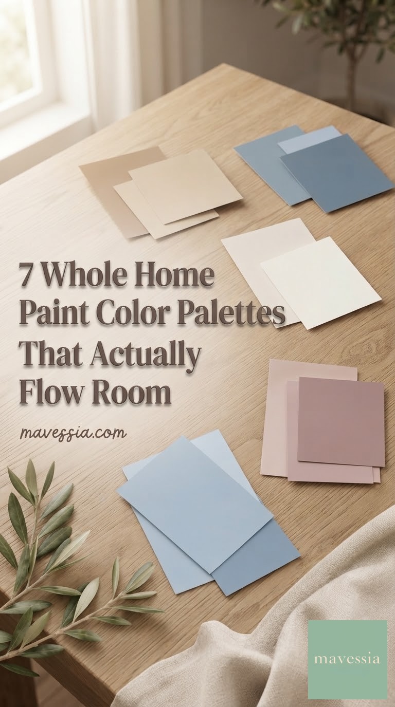
The Paired Palette: Light and Dark, Room by Room
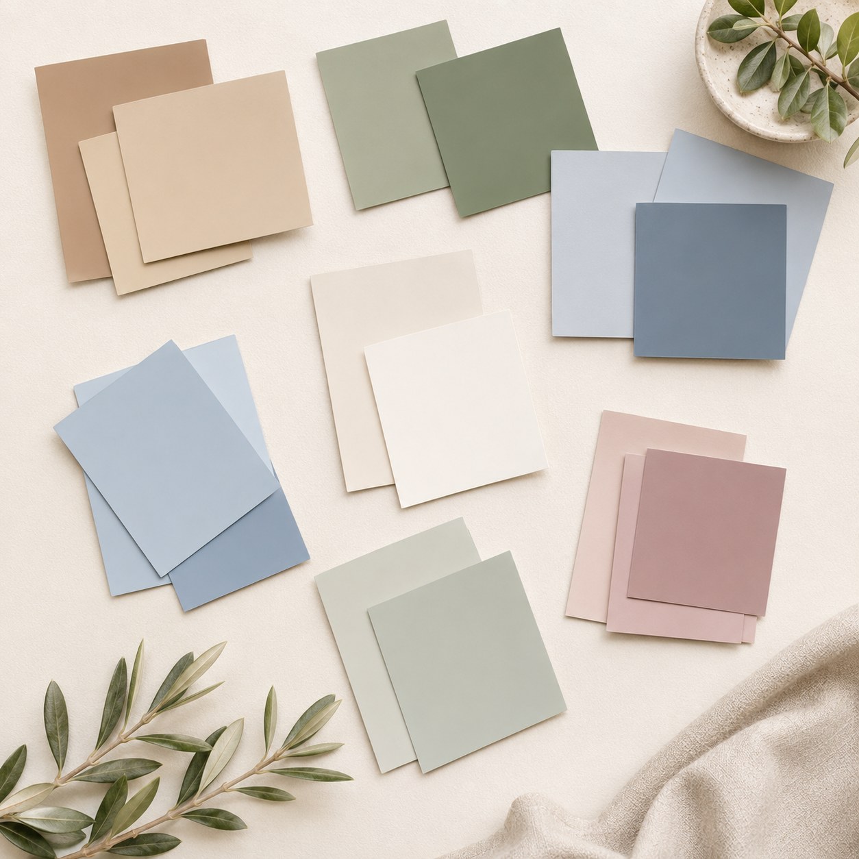
This is the most planner-brained palette of the seven, because it's organized in pairs before you even walk into a room: a lighter and darker taupe, a lighter and darker sage, a soft and a deeper blue, a cream duo, a dusty pink pair. Each pairing is a self-contained decision for one room.
The logic: use the lighter half of a pair on the walls, the darker half on trim, a door, or cabinetry within that same room — then move to the next pair for the next room. The whole house still reads as one story because every pair shares the same soft, muted saturation level, even as the hues rotate from sage to blue to blush.
It's the palette I'd recommend to a family blending two people's color instincts under one roof — everyone gets a favorite hue, nothing has to match the room next door exactly, and the underlying softness keeps the whole thing from feeling like a patchwork.
The Applied Neutral: What This Actually Looks Like Lived-In
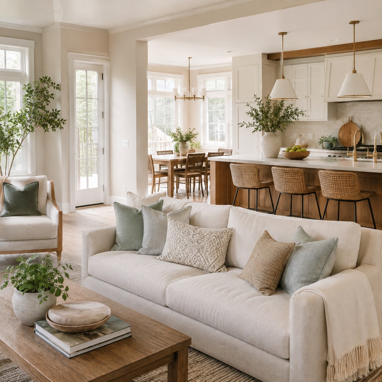
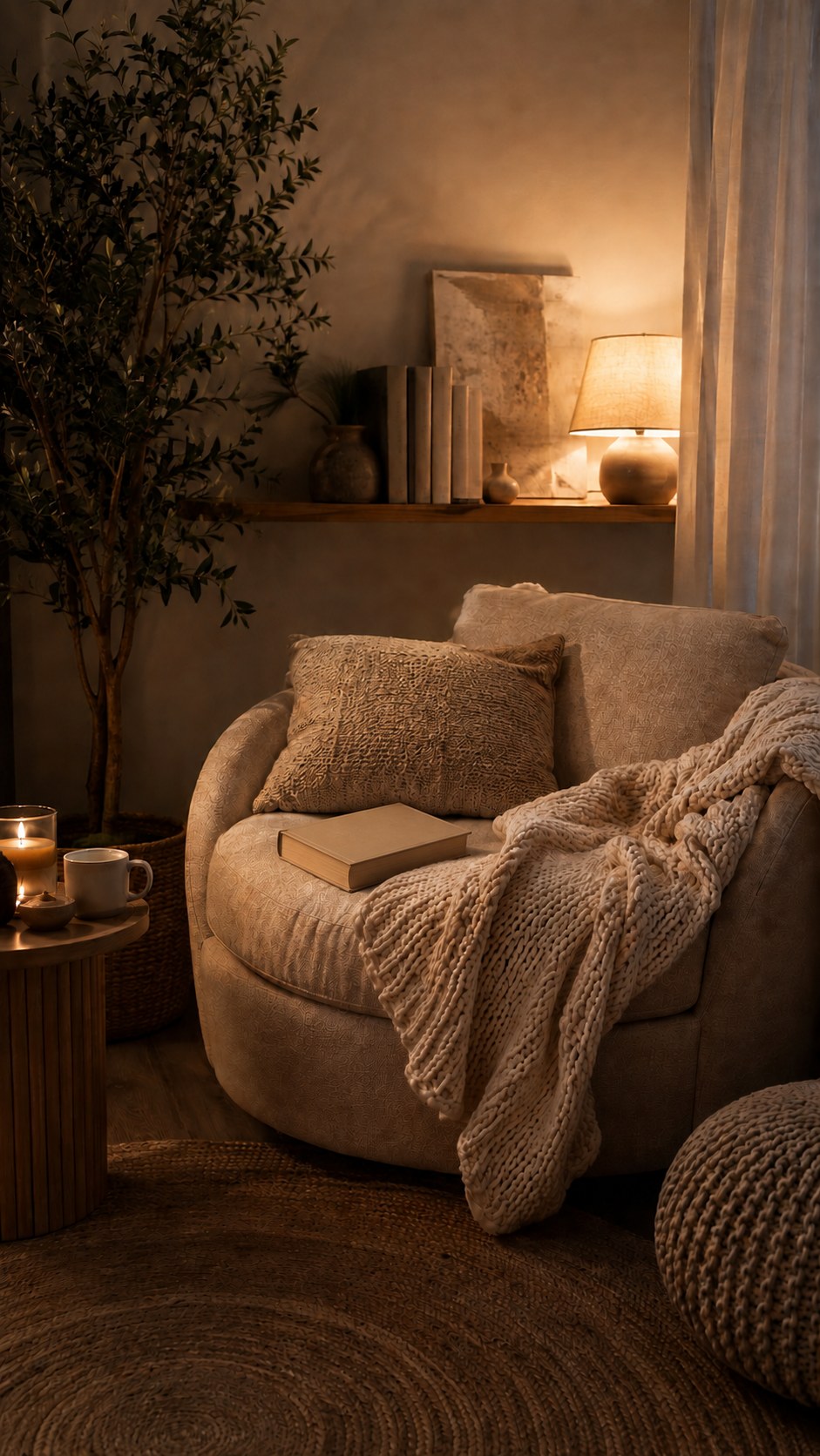
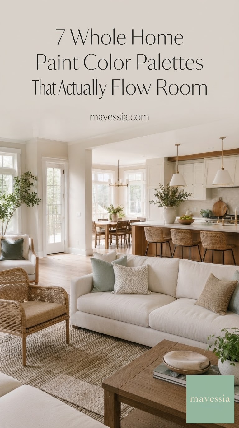
Swatches are one thing; a finished room is another. This is a warm-white-and-cream whole-home palette doing its actual job — open kitchen, dining, and living space reading as one continuous room instead of three competing ones, with sage and warm tan textiles doing the seasonal work instead of the walls.
This is the test I run on every palette before I trust it: stand at the farthest point of an open floor plan and look back through every doorway. If the wall colors read as one calm family from that distance, the palette passes. If your eye snags on a mismatch between the kitchen cabinets and the living room trim, it hasn't.
The other thing this room gets right — the color does the quiet, permanent work, and the pillows, throws, and greenery carry the personality. That's the arrangement that lets you refresh a room for a season or a holiday without repainting anything, which is the whole point of picking a durable neutral in the first place.
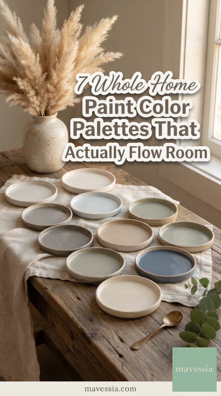
The Eight-Tone Capsule: Small-Dose Colors for the Details
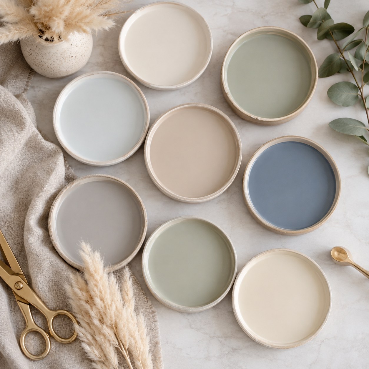
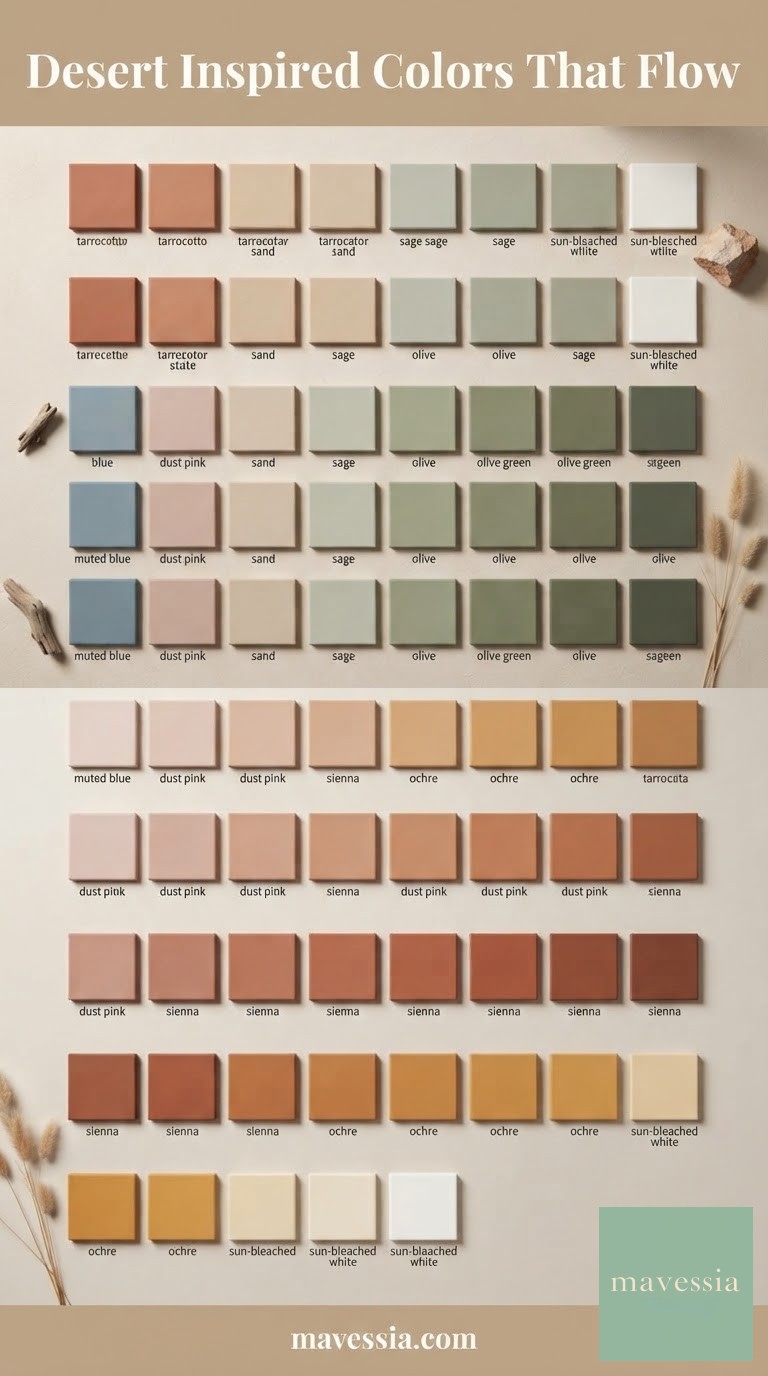
Not every whole-home palette needs to live on walls. This eight-tone set — cream, sage, blush, dusty blue, taupe, gray, a second sage, ivory — works best as the palette you reach for on the details: a stair riser, a built-in bookcase, a set of interior doors, a powder room.
- Pick two or three as your recurring "accent tones" for doors and trim throughout the house
- Leave the rest as options for future rooms — a nursery, a home office, a reading nook
- Keep them all at the same saturation level so nothing shouts over another
I think of this as the palette's junk drawer, in the best sense — a bench of good, coordinated options you pull from as the house evolves, rather than a rigid five-color plan you have to commit to on day one. It's forgiving for a family whose rooms get repurposed as kids grow.
A palette is only as good as the walk-through test — stand in one doorway and let your eye travel through three rooms. If it feels like one calm decision instead of eight small arguments, you've got your seven cans and you're ready to tape off the trim.





Frequently Asked Questions
How many colors should a whole-home paint palette actually have?
I aim for five to eight, organized around one undertone family. More than that and rooms start competing; fewer and large houses feel flat. The eight-can and eight-tone palettes here work because every color shares the same saturation level, even when the hues vary.
Should the whole house be the same color, or different colors per room?
Different colors, same family. I've never seen a house feel more finished for being one flat color throughout — the paired and tonal palettes above use light-to-dark variation within one undertone, which reads as intentional rather than repetitive.
What's the biggest mistake people make picking a whole-home palette?
Choosing swatches in isolation instead of side by side, in the actual room, at the actual time of day the room gets used most. A gray that looks perfect at noon can turn blue under evening lamplight — test everything together before a single gallon gets bought.